- What types of visualizations were you able to generate in Excel using PivotChart? How could those visualizations shape or impact your understanding of the data? Did you generate any visualizations that were confusing or misleading? Alternatively, did you generate any visualizations that were unexpected or illuminating?
I was able to create a wide variety of different statistical visualizations using PivotChart, including bar charts, pie charts, histograms, and more. It became apparent pretty quickly that different types of charts were better for visualizing different kinds of data like bar charts were better at handling categorical data. At the same time, histograms or scatter plots are better at portraying quantitative data.
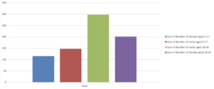
I tried to add occupation to the bar chart as a variable and ended up with a rather messy and confusing graph, it feels like that might be better suited for some kind of table. That is also one of the complications with visualizing census data, is that there are a lot of different variables and a lot of data points in the data set.